1. Introduction
In the fiercely competitive coffee market of 2025, the silent salesman on the shelf—the coffee bag—shouts louder than ever. Long gone are the days when simple, generic packaging would suffice. Today, custom coffee packaging is a critical touchpoint, a tangible piece of a brand’s story that can captivate a customer from across the aisle or through a screen. It’s the first handshake, the initial promise of the quality and experience contained within. For coffee brands, from burgeoning micro-roasters to established names, the choice of design is a pivotal business decision. For consumers, it's a visual cue that guides them toward a brew that matches their lifestyle, values, and aesthetic preferences.
This guide is designed to address the most common questions and challenges faced by coffee brands and discerning consumers. We will delve into two of the most powerful and contrasting design trends shaping the industry: the audacious, vibrant energy of Pop-Art and the serene, considered elegance of Japanese Minimalism. Which style holds the key to consumer hearts in 2025? By exploring the characteristics, target audiences, and strategic implications of each, we will equip you with the insights needed to choose a coffee bag design that not only looks stunning but also drives sales and builds a loyal following.
.

2. Understanding Pop-Art Style for Coffee Bags
Definition and Characteristics
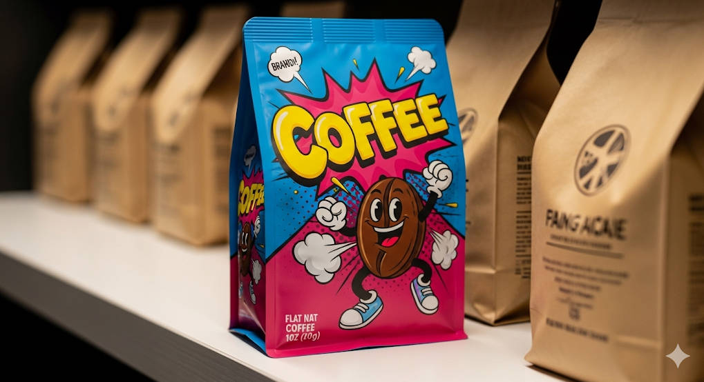
Pop-Art, a movement born from a post-war culture of mass media and consumerism, translates into coffee packaging as a celebration of the bold, the bright, and the playful. It rejects subtlety in favor of immediate impact. Pop-Art style coffee packaging is characterized by a vibrant, high-contrast color palette, repetitive graphic patterns, playful or witty illustrations, and bold, often chunky, typography. Think comic book-style Ben-Day dots, Warhol-esque color blocking, and imagery that transforms the mundane coffee bean into a dynamic icon. This style is energetic, confident, and unapologetically modern, often incorporating a sense of humor and irony. The goal is to be unmissable.
Appeal and Target Audience
The primary appeal of a Pop-Art coffee bag design lies in its power to disrupt. It’s an instant attention-grabber, radiating a youthful, contemporary, and often urban vibe. This aesthetic connects powerfully with younger demographics, particularly Millennials and Gen Z, who value authenticity, self-expression, and brands that don't take themselves too seriously. It thrives in bustling urban markets, trendy cafes, and on the visually-driven feeds of social media. A brand using Pop-Art is signaling that it is modern, approachable, and part of the cultural zeitgeist.
Common Questions Addressed
How does Pop-Art stand out on retail shelves? In a sea of earthy tones and traditional designs, Pop-Art acts as a visual siren. The use of saturated colors and striking graphics ensures that a Pop-Art coffee bag is often the first thing a customer's eye is drawn to. This immediate differentiation is a massive advantage in crowded retail environments where purchasing decisions are made in seconds. It breaks the visual monotony and creates intrigue, prompting the consumer to pick up the bag and learn more.
Is it suitable for premium or specialty coffee brands? Absolutely, but with a strategic approach. While traditionally associated with mass-market appeal, Pop-Art can be cleverly adapted for specialty coffee packaging. A premium brand might use Pop-Art to signify a unique or experimental coffee profile, like a vibrant, fruity single-origin from a specific micro-lot. The key is to ensure the quality of the packaging materials—such as high-grade foils, matte finishes with spot UV gloss, and robust construction—matches the premium quality of the coffee inside. This juxtaposition of playful design and high-quality execution can create a highly memorable and desirable product.
How does it align with sustainability trends? Pop-Art's boldness is not at odds with eco-consciousness. In fact, it can be a powerful tool for highlighting a brand's commitment to sustainability. Brands can use vibrant, eco-friendly, soy-based inks on recyclable coffee bags or compostable coffee pouches. A playful illustration could depict a brand’s direct trade relationship with farmers or its commitment to organic practices. The contrast between the fun, modern aesthetic and the serious message of sustainability can make the brand's efforts more approachable and memorable for consumers who want to make responsible choices without being lectured. Using a simple kraft paper coffee bag as a canvas for a blast of Pop-Art color can create a stunning and effective design.

3. Exploring Japanese Minimalist Style for Coffee Bags
Definition and Characteristics
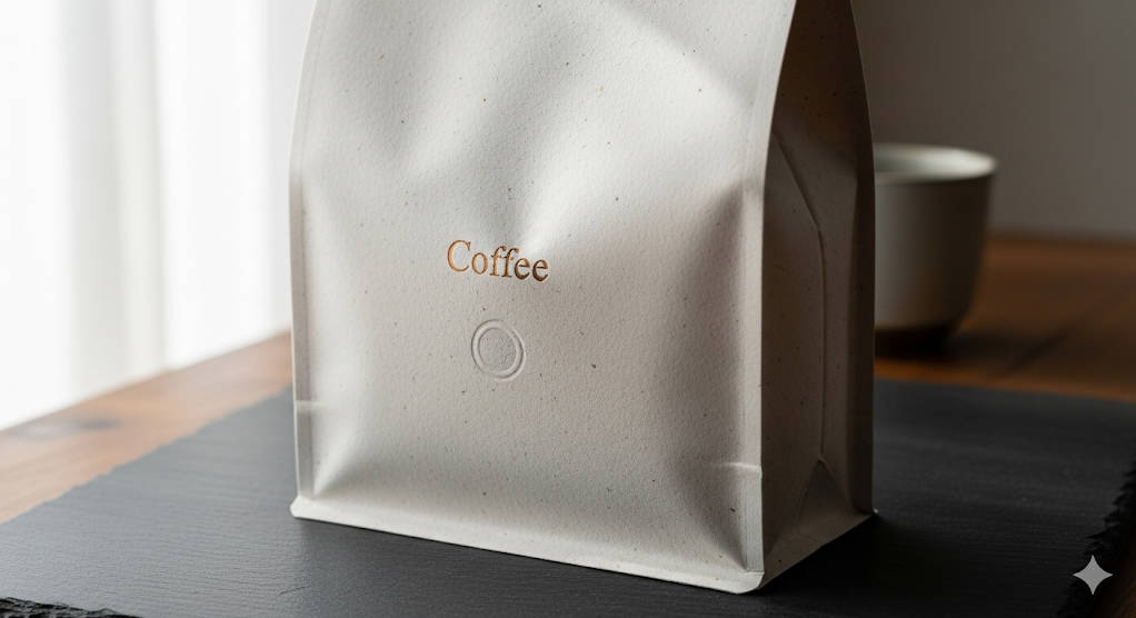
Rooted in the traditional Japanese philosophies of Zen, Wabi-Sabi (finding beauty in imperfection), and Ma (the importance of negative space), Japanese Minimalism is the antithesis of Pop-Art. It is an exercise in restraint and intention. Japanese Minimalist coffee packaging is defined by its clean lines, uncluttered layouts, a muted or neutral color palette, and a focus on texture and high-quality materials. Typography is often delicate and precise. Imagery, if used at all, is subtle and symbolic—perhaps a simple brushstroke (ensō), a blind-embossed pattern, or a single, elegant line drawing. The design is not about what is added, but about what is stripped away to reveal the essential.
Appeal and Target Audience
The appeal of minimalist coffee packaging is its timeless sophistication and the sense of calm it evokes. It communicates a message of purity, quality, and craftsmanship. This aesthetic creates an aura of authenticity and care, suggesting that the coffee inside has been sourced and roasted with the same meticulous attention to detail. It strongly resonates with artisanal coffee enthusiasts, connoisseurs, and consumers of premium or luxury goods who appreciate understated elegance. Furthermore, its emphasis on natural materials and simplicity makes it a natural fit for eco-conscious consumers and brands focused on organic, single-origin, and sustainably sourced beans.
Common Questions Addressed
How does minimalism convey quality and authenticity? Minimalism operates on the principle of "less is more." By removing visual clutter, a minimalist design places the focus squarely on the quality of the materials and the essential information about the coffee. The tactile feel of a textured paper bag, the precision of the typography detailing the coffee's origin and tasting notes, and the generous use of white space all combine to create a perception of high value. This confidence to be simple suggests the product itself is so exceptional it doesn't need to shout for attention.
Does it risk being too subtle in competitive markets? This is a valid concern. In a visually noisy environment, a minimalist bag could potentially be overlooked. However, its success hinges on execution and context. On a crowded supermarket shelf, it might struggle next to a Pop-Art competitor. But in a specialty coffee shop, a high-end delicatessen, or on a curated website, its quiet confidence becomes a mark of distinction. Brands can mitigate this risk by focusing on unique structural designs, exquisite material choices (like textured papers or unique bag shapes), and subtle but luxurious finishing touches like foil stamping or embossing, which invite a closer look.
How does it incorporate cultural elements without being overly niche? The beauty of Japanese Minimalism is that its core principles—simplicity, harmony, and nature—are universally understood and appreciated. Brands can draw inspiration from Japanese aesthetics without resorting to clichés. This can be achieved through the use of traditional Japanese color combinations (like indigo and white), patterns inspired by nature (like "asanoha" or "seigaiha"), or by emphasizing the texture of materials reminiscent of washi paper. The goal is to evoke a feeling of Japanese craftsmanship and philosophy rather than simply applying overt cultural symbols, ensuring the design has a broad, global appeal while retaining its unique character.
4. Comparing Pop-Art and Japanese Minimalist for Coffee Bags
Choosing between these two powerful styles requires a deep understanding of a brand's identity, target market, and business objectives. The following table breaks down their key differences across several critical dimensions.
Feature | Pop-Art Style | Japanese Minimalist Style |
Visual Impact | High Impact & Immediate. Disruptive, loud, and designed to grab attention instantly from a distance. Uses bold colors and graphics. | Subtle & Considered. Invites closer inspection. Creates a sense of calm and premium quality through texture and space. |
Brand Alignment | Best for brands that are modern, youthful, energetic, playful, and approachable. Aims to be part of pop culture. | Best for brands that are artisanal, premium, traditional, authentic, and sophisticated. Aims to be timeless. |
Target Audience | Younger demographics (Gen Z, Millennials), urban consumers, trend-followers, social media savvy shoppers. | Coffee connoisseurs, affluent consumers, eco-conscious buyers, individuals who value craftsmanship and heritage. |
Communicates | Fun, excitement, accessibility, uniqueness, creativity. "Try me, I'm new and different!" | Quality, purity, craftsmanship, authenticity, luxury. "Trust me, I am the highest quality." |
Shelf Presence | Stands out through contrast and color. Easily identifiable in a crowded, competitive environment. | Stands out through elegance and simplicity. Creates a "less is more" allure in a curated or premium setting. |
Digital Marketing | Highly shareable on visual platforms like Instagram and TikTok. Bright colors and fun designs create "Instagrammable" moments. | Performs well on platforms focused on storytelling and aesthetics, like Pinterest and design-focused blogs. Conveys quality through high-resolution photography. |
Practical Considerations | Can involve complex, multi-color printing, which may increase costs. Works well on a variety of materials, including glossy finishes. | Printing can be more cost-effective due to fewer colors, but costs can rise with special materials (textured paper) and finishes (embossing, foil). |
Common Questions Addressed
Which style better communicates premium quality? While both styles can be used for premium products, Japanese Minimalism is inherently more aligned with traditional perceptions of luxury and high quality. Its focus on refined details, superior materials, and understated confidence is a classic signifier of a premium product. However, Pop-Art can communicate a "modern premium"—one based on creativity, exclusivity, and unique flavor experiences, appealing to a different type of luxury consumer.
How do these styles perform in digital marketing? Pop-Art is a natural fit for the fast-paced, visual world of social media. Its vibrant, graphic nature makes for eye-catching posts and shareable content. It’s easy to build a dynamic, colorful brand identity around it online. Japanese Minimalism excels in a different digital context. It requires more thoughtful photography that emphasizes texture, light, and mood. It’s perfect for creating a serene and aesthetically pleasing Instagram grid or a beautifully designed e-commerce site that tells a deeper story about the coffee's origin and craft.
5. 2025 Market Trends and Consumer Preferences
The choice between Pop-Art and Minimalism doesn't happen in a vacuum. It must be informed by the broader trends shaping the coffee industry and consumer behavior in 2025.
The Unstoppable Rise of Sustainability
Sustainability is no longer a niche concern; it's a primary driver of purchasing decisions. Consumers in 2025 are actively seeking out brands that use eco-friendly coffee packaging, including materials that are recyclable, compostable, or made from post-consumer waste. This has led to a surge in the popularity of kraft paper coffee bags, PLA-lined pouches, and innovative material solutions. Both design styles can adapt to this trend. Minimalism, with its natural and earthy aesthetic, aligns seamlessly with unbleached kraft paper and simple, eco-friendly inks. Pop-Art can make a bold statement by using its vibrant designs to proudly call out the bag's sustainable features, making green choices fun and stylish.
The Influence of Social Media and E-commerce
With a significant portion of coffee sales happening online, packaging must be "photogenic." It needs to look as good in a product photo on an e-commerce site as it does on a kitchen counter in an influencer's post. This is where the visual strategy becomes paramount.
Are Pop-Art designs more shareable on platforms like Instagram? Generally, yes. Pop-Art's bold graphics and bright colors are tailor-made for quick scrolling and instant engagement on platforms like Instagram. They create a strong visual hook that encourages likes, comments, and shares, effectively turning customers into brand ambassadors. The unboxing experience of a brightly designed package is itself a shareable moment.
Does Japanese Minimalism appeal to global or niche markets? Japanese Minimalism has a broad global appeal, particularly within the premium and specialty coffee segments. Its principles of simplicity and quality are universally understood by discerning consumers worldwide. While it may start in niche, high-end markets, its influence often trickles down, setting the standard for what is perceived as elegant and high-quality across the board.
6. Practical Tips for Choosing the Right Design
Making the final decision requires a blend of creative vision and practical strategy. Here are some actionable tips for coffee brands.
Align Design with Brand Values and Audience: Before you fall in love with a style, look inward. Is your brand story about fun, community, and breaking traditions? Pop-Art is a natural fit. Is it about heritage, meticulous craft, and the pure taste of a single-origin bean? Japanese Minimalism will tell that story effectively. Deeply understand who your target customer is and what visual language speaks to them.
Balance Aesthetics with Functionality: A beautiful bag that is frustrating to use will not win repeat customers. Ensure your design incorporates essential functional features. Critical features for modern coffee bags include secure resealable zippers to maintain freshness, one-way degassing valves to allow CO2 to escape without letting oxygen in, and clear, legible labeling. The design must accommodate this information without feeling cluttered.
Work with Professional Designers: While it can be tempting to use a template, partnering with a professional packaging designer is an investment that pays dividends. A good designer will not only create a beautiful aesthetic but will also understand the technical requirements of printing, material compatibility, and how to create a design that works across different bag sizes and formats.
Common Questions Addressed
How to test a design’s effectiveness before mass production? Before committing to a large and expensive print run, testing is crucial. Create high-quality mockups or a small batch of digitally printed coffee bags. Show them to a sample of your target audience and get their feedback. Place them on a mock retail shelf next to competitors to see if they stand out. Test their photogenic qualities by taking pictures for social media. This feedback is invaluable for making final tweaks.
What are the cost implications of each style? The cost is less about the style itself and more about the execution. A Pop-Art design with eight different colors will be more expensive to print than a minimalist design with two. However, if that minimalist design requires imported textured paper and a multi-step embossing and foil stamping process, it could easily become the more expensive option. It's essential to get quotes from your coffee packaging supplier based on the specific colors, materials, finishes, and order volume.
7. Case Studies
To illustrate these principles in action, let's look at two hypothetical but realistic brand scenarios.
Example 1: "Static Buzz Coffee" - Boosting Visibility with Pop-Art
The Brand: A new roaster based in Brooklyn, targeting young professionals and creatives. Their coffee profiles are experimental and bright, often featuring unique fermentation methods. Their brand voice is witty and energetic.
The Design: Static Buzz opts for a flat bottom pouch made from a recyclable material with a matte finish. Each coffee origin is given its own unique, explosive Pop-Art design, featuring loud, clashing colors and comic-book-style illustrations of lightning bolts and coffee beans with personalities. The logo is a bold, bubble-letter font.
The Result: On the shelves of local grocery stores, the bags are impossible to ignore. They become an instant hit on Instagram, with customers eagerly sharing photos of the vibrant packaging. The design perfectly communicates the coffee's energetic and unconventional flavor profile, attracting a loyal following of adventurous coffee drinkers. The packaging becomes a collectible item, driving customers to try every origin.
Example 2: "Komorebi Roasters" - Premium Positioning with Japanese Minimalism
The Brand: An established, high-end roaster specializing in rare, competition-winning Geisha and Bourbon varietals. They have direct, long-standing relationships with their farmers. Their brand is built on trust, expertise, and a reverence for the coffee bean.
The Design: Komorebi chooses a side gusset bag made from a thick, textured, off-white paper composite. The only design elements on the front are the brand name, elegantly foil-stamped in a dark bronze, and the specific lot number, delicately blind-embossed. All other information (origin, tasting notes, roast date) is printed on a simple, beautifully typeset label on the back. The entire design feels spacious, tactile, and serene.
The Result: The packaging immediately signals luxury and craftsmanship. It doesn't compete for attention; it commands respect. It appeals to serious coffee connoisseurs who are willing to pay a premium for an exceptional product. The unboxing experience feels special and ritualistic. In high-end retail environments and on their own e-commerce site, the design reinforces their position as a leader in artisanal coffee.
8. Conclusion
The battle between Pop-Art and Japanese Minimalism for the title of the ultimate coffee bag design of 2025 has no single winner. Each style offers a powerful and distinct path to capturing consumer attention and loyalty.
Pop-Art is the language of energy, disruption, and modern approachability. It’s the perfect choice for brands looking to make an immediate impact, connect with a youthful audience, and build a vibrant community online.
Japanese Minimalism is the language of quality, authenticity, and timeless elegance. It’s the ideal path for brands that want to communicate supreme craftsmanship, justify a premium price point, and attract customers who value substance and story.
The most critical takeaway is to choose a design path with intention. The right choice is not about chasing a trend but about deep alignment between your packaging, your brand's core values, and the desires of your target market. In 2025, the most successful coffee brands will be those who understand that their packaging is not just a container; it's a connection. So, experiment with mockups, test your concepts, and above all, choose the design that tells your unique story most compellingly.
Ready to brew up your perfect packaging?
Explore and Experiment: Don't commit without experimenting. Use online tools or work with a designer to create mockups of your coffee bag in both Pop-Art and Japanese Minimalist styles. See how your brand name and story feel in each context.
Find Professional Partners: Your vision deserves expert execution. Seek out experienced packaging designers and reputable coffee packaging suppliers who can provide samples of different materials and finishes.
Engage Your Audience: Your customers are your best resource. Share potential designs on social media and ask for feedback. Run a poll. Their reactions will provide crucial insights into which style resonates most powerfully.


